
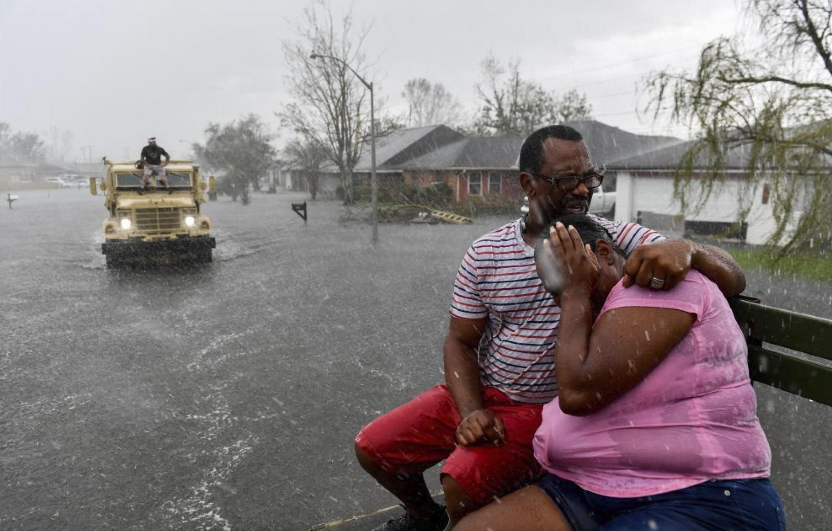
People suffering from Hurricane Ida. August 20, 2021. Louisiana. Photo by https://prismreports.org/
Hurricane Warning Web App Redesign
ABOUT
Q-risq is a hurricane weather forecasting company based in Slidell, LA.
Q-risq provides hurricane predictions in advance thanks to distributed geospatial analytics engines on big data.
CLIENT’S PROBLEM
The client approached us with an existing MVP product with hundreds of active Louisiana-based users. User feedback indicated potential usability and UI issues, but stakeholders struggled to articulate problems clearly.
CHALLENGE
– Communicate poor UX to stakeholders,
– Prioritize the issues,
– Design and test the solutions in a tight timeline (6 weeks).
TEAM
– Project Manager,
– UX Strategist,
– Engineer Lead,
– I’m a UX/UI Designer.
MY ROLE
– Research and analysis,
– UX and UI redesign,
– Design library kit.
TIMELINE
6 Weeks
TL;DR
Before redesign

After redesign

IMPACT
Reduced bounce rate across the sign-up and payment process by creating a streamlined experience.
Decreased customer support backlog by 43% by improving website clarity, UX, and self-service.
Drove an 82% increase in user satisfaction
Improved address confirmation process accuracy by 13%, leading to more reliable hurricane predictions.
Created and managed a Figma UI Kit serving as the foundation for a future design system.
Developed an educational onboarding experience to guide new users effectively.
01: Dive into the World of Hurricanes
Why does the client want improvement?
BUSINESS ASPECT
Expand the web app’s service area
The client service covered Louisiana and aimed to establish the product in Mississippi before hurricane season (June 1–November 30), targeting 20,000 sign-ups.
User satisfaction was a critical metric for this new business initiative.

The map shows the U.S. states most affected by hurricanes.
The customers and what they are looking for
PERSONA/RESEARCH
Human Spark as a key to stakeholders’ hearts
My stakeholders were scientists and data analysts. Presenting a proto-persona based on real users shifted our conversations and highlighted the human side of the product.
! It was a big WIN for me because the collaboration shifted the focus from “numbers and data” to user-centered thinking
USERS’ INSIGHTS SUMMARY
Users’ characteristics:
– Property owners (homeowners)
– Middle and high-income
– Users age 35 – 70 y.o.
– Geographical location: hurricane-vulnerable states the current users are coming from “word of mouth”
Users’ objectives:
– Stay safe
– Be prepared for the upcoming hurricane (understand weather conditions surrounding their home preferably a couple of days before the storm hits)
– Have proof of the hurricane damage done for the insurance company business.
Get deeper into the product
RESEARCH/UX AUDIT
Heuristic analysis outlining the key usability problems and improvement opportunities.
I divided the work scope into 3 parts:

Pre-onboarding
Pre-onboarding is the marketing website’s Home page, where the product is introduced. It was a low priority on our roadmap and postponed, but the marketing website is strategically important for UX as it creates a seamless bridge to the web app.

Onboarding – registration and payment process
The onboarding experience is critical—when it’s smooth and easy, it builds customer loyalty and trust.

Web App Experience – direct access to product functionality
The most valuable screen for customers shows hurricane details and how close the storm is their property. From there, they can make vital decisions—whether to stay or evacuate—and prepare for what lies ahead.
Learning from the competition
MARKET RESEARCH
Weather forecasting language should be universal and intuitive, allowing users to understand icons and signs instantly without confusion.
To achieve this, I analyzed common UI patterns that users already know and trust.

02: Recap and create
ONBOARDING key problems
CHALLENGE 1
How to log in?
There is a disconnect between the marketing website, where users register, and the web app, where they can access all functionality. After registering through the marketing website, users received an email link, which was the only way to access the web app.
Use the marketing website for user sign-ups and logins
I proposed improvements to the marketing website’s navigation and information architecture.
Before

After

ONBOARDING key problems
CHALLENGE 2
Primary interaction: “Does it work for my property?”
The hurricane predictor has limited coverage. Customers must register before they can determine if their address is within the service area, which can be frustrating and may stop them from signing up.
Find out immediately if you’re in the service area
From the first page of the marketing website, customers can check if their address is within the service area.
Before
After

ONBOARDING – property placement
CHALLENGE 3
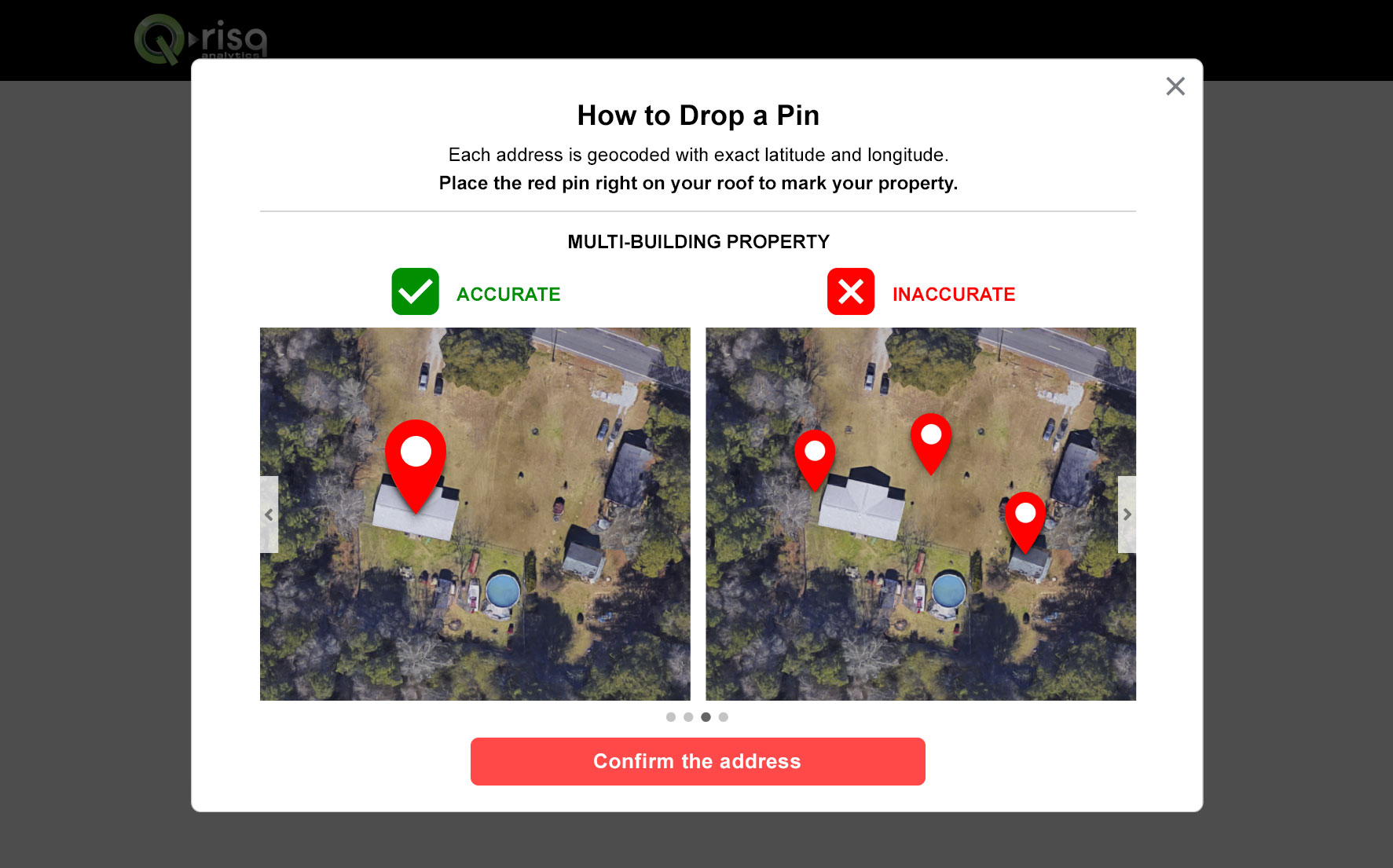
Very Important! – Address confirmation
For data accuracy, customers must place the pin on the roof of their property, not in the surrounding area. To highlight this and guide users, I created tutorials for different property types.
Fact: 23% of the time, the Google Maps API (we use Google Maps API for the map) works incorrectly, and users have difficulties with the accurate address location.
Drop a red pin tutorial
I created a visual guide to help users place pins correctly across all property types, including urban, rural, multi-building, and commercial properties.

The process users go through to archive hurricane view.
WEBAPP areas of improvement
CHALLENGE 1
“Where can I find…?” – Navigation
The web app’s main navigation is confusing and unclear, making it difficult for users to find what they need.
Find it fast, use it easily
I proposed two navigation improvement concepts, which we then refined through iterations with the stakeholders.
I also suggested including:
– FAQ page to explain all the terminology (34% of the interviewees were confused about terminology)
– The tutorial page explains how to use the web app’s features (25% of interviewees needed help with filtering and distance measurement).
Before

After
WEBAPP – 2 problems 1 solution
CHALLENGE 2
“What am I looking at?”
Visual clutter and a lack of visual hierarchy make it difficult to comprehend the information.
Outdated style and broken consistency affect the layout
The layout differs from typical weather websites, causing familiarity issues and making it harder for users to navigate and use the product intuitively.
Less noise – more focus
I redesigned the layout and reorganized the information for better clarity, prioritizing only the most essential content on the screen.
Before

After
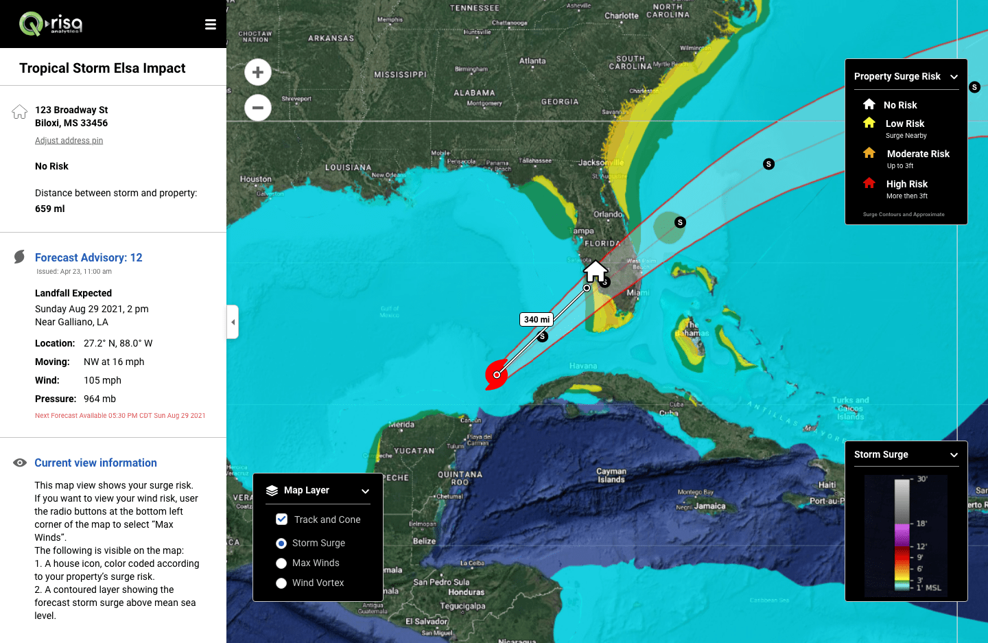
The main dashboard shows hurricane locations in relation to the user’s address
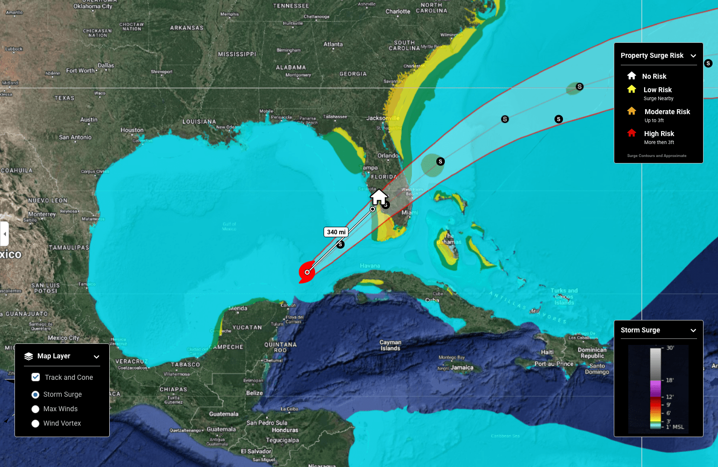
On the main dashboard, the left sidebar is hidden.
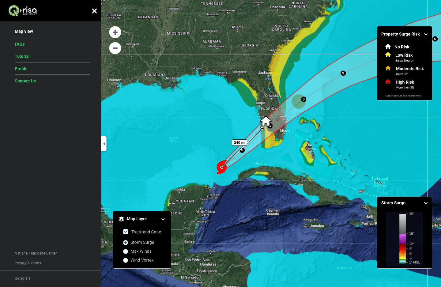
The main dashboard. The navigation.
Some design screens
MARKET RESEARCH

The customer’s address is out of the service area.

The customer’s address is within the service area.

Create an account.

Payment for the service.

The account has been created. Proceeding to personal address predictions.

To address all customer questions, I suggested adding an FAQ screen.
My retrospective thoughts
– I dove deeper into weather forecasting, a new field for me.
At first, it caused anxiety, but this quickly dissipated as I educated myself about the subject.
The message to myself – “If you don’t know something, don’t waste time stressing—learn it!”– I strengthened my communication skills—confidently presenting ideas to stakeholders, demonstrating the value of the UX process for business, and earning their trust. Though challenging, marketing research and analysis proved invaluable.
– “Data is a king”. Having data was a great starting point for project analyses and design decision making.